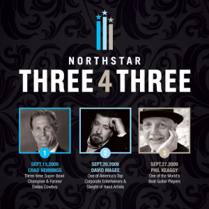
 I’d like to post some designs worth complimenting from time-to-time. This design, except for the circle really close to Chad’s chin has a high quality of design. The unified color palette, and the overall aesthetic really give it a top-notch look and professional quality. Notice how the three vertical bar’s colors relate to the three circles over the photos. Clear hierarchy is a put to work here. The background adds class without being over powering.