Skip to content
Search for:
X
Search for:
X
  • Ebert Creative

Ebert Creative

It's not a website, it's a goal!

Tag: Typeface

Underline me not

Avoid Underlining-Ebert Creative

Designers have the ability to use so many options to make a headline or any amount of text more prominent that underlining
Read More

February 21, 2015June 25, 2021 aebert
Design Tips Headline, Typeface, Underline

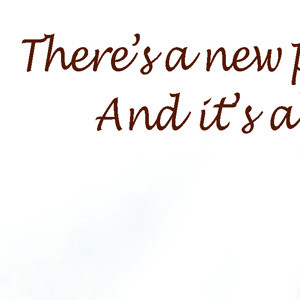
Design it like you write it

Apostrophe Example Ebert Creative

When using script typefaces, treat apostrophes like you would when writing by hand. Connect the whole word then have the apostrophe in

Read More

January 31, 2015June 25, 2021 aebert
Design Tips Apostrophe, Typeface

Kerning—It’s On You

Kerning Example—Ebert Creative

It should be emphasized, when designing, that everything on a “page” is the designer’s responsibility. Every character, shape, line, etc. This is why

Read More

January 22, 2015June 25, 2021 aebert
Design Tips Kerning, Leading, Typeface

Recent Posts

  • Lost Art of Illustrations
  • Slogans should be quote free.
  • Streamline the content
  • Creative Banner Design
  • Formatting Contact Info on Business cards and other promotional items

Tags

Ad Add aesthetic Background banner Baseline Shift branding Bullets Call-to-action Clutter Colons Color colors Contrast Creative Dash Dashes Design Tips Direction element emphasis Eye Flow Format Formatting Grouping Headline Hierarchy Illustration Inspiration Kerning Leading Numbers Outline Photo process proofing proportions quotes Random Readable Scale Space-between Typeface Underline Value

Categories

  • Design Tips (25)
  • Good Design (4)
  • Random (4)
  • Uncategorized (1)
Powered by WordPress

All rights reserved © Ebert Creative Fast Press Theme by Seos Themes