In the past several years, photos have take front and center as far as use. They are easy to find and easy to purchase. The downside is that most advertising and printing are all using photos. Illustrations aren’t used as much as they used to. A word to the wise designer. Illustrations will stand out… Continue reading 
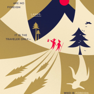
Lost Art of Illustrations
Slogans should be quote free.
People design their slogans often times with quotations. This is and old feature that doesn’t have a place with a modern slogan. If the slogan is truly someone’s quote then go for it but leave the quotes off if it is just a statement. Aim to also have your slogans be unique to your type… Continue reading Slogans should be quote free.
Streamline the content
Here is an example of too much clutter. This format can be streamlined more effectively. Remove the duplicate “:00” and the extra spaces around the dash. The dash should also be an EN dash. While you are at it, don’t forget the space before the “pm”
Creative Banner Design
It isn’t hard to design an effective web ad and taking it to the next level is critical in order to make an impact and effective impression on the viewer. This ad has some creative elements that he bring it to the next level. I want to add that this web banner ad needs a… Continue reading Creative Banner Design
Formatting Contact Info on Business cards and other promotional items
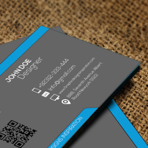
Here are some good examples of formatting contact info.
Group your bullets
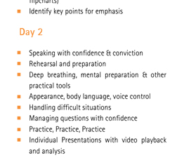
Bulleted lists are very common and often times a designer will just set the leading but not the space-between paragraphs. The problem this causes is that all the lines of info are equally spaced and don’t have clear groupings. If space-between was used and the leading reduced the bulleted info would be grouped appropriately and… Continue reading Group your bullets
Underline me not
Designers have the ability to use so many options to make a headline or any amount of text more prominent that underlining should be one of the last options we consider. There is a difference between using a line as a divider but when it is as an underline you are digressing to the days… Continue reading Underline me not
Face it into the ad
It may be a subtle item but the direction images face are important. In this example the camera is facing off of the ad. If this were a photo of a person they would be looking away from the content. Aim to have items looking into the ad so the eyes point to the ads… Continue reading Face it into the ad
Between the Lines
I have never understood how designers determined that outlining type helped make it more readable. Unfortunately, it actually makes type harder to read. It is like putting an annoying sound in the background of your favorite sound. How about the sound of fingernails on a chalkboard. It just makes you cringe. It would be better… Continue reading Between the Lines
Proportional response
Somehow the approval process was dropped here. I can’t imagine Smart Bank was OK with all their photos were squished. It is amazing how many people don’t realize they aren’t resizing their images proportionally. The Shift key is the perfect help for this.