Skip to content
Search for:
X
Search for:
X
  • Ebert Creative

Ebert Creative

It's not a website, it's a goal!

Category: Design Tips

Slogans should be quote free.

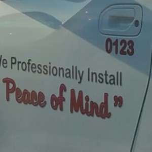
People design their slogans often times with quotations. This is and old feature that doesn’t have a place with a modern slogan.

Read More

April 2, 2015June 25, 2021 aebert
Design Tips quotes

Streamline the content

Streamline info-Ebert Creative

Here is an example of too much clutter. This format can be streamlined more effectively. Remove the duplicate “:00” and the extra

Read More

March 23, 2015June 25, 2021 aebert
Design Tips Clutter, Dash, Format

Group your bullets

Space-between Bulleted List-Ebert Creative

Bulleted lists are very common and often times a designer will just set the leading but not the space-between paragraphs. The problem

Read More

February 27, 2015June 25, 2021 aebert
Design Tips Bullets, Grouping, Leading, Space-between

Underline me not

Avoid Underlining-Ebert Creative

Designers have the ability to use so many options to make a headline or any amount of text more prominent that underlining

Read More

February 21, 2015June 25, 2021 aebert
Design Tips Headline, Typeface, Underline

Face it into the ad

Images Facing into the ad

It may be a subtle item but the direction images face are important. In this example the camera is facing off of

Read More

February 19, 2015June 25, 2021 aebert
Design Tips Ad, Direction, Eye Flow

Between the Lines

Avoid Outlines Ebert Creative

I have never understood how designers determined that outlining type helped make it more readable. Unfortunately, it actually makes type harder to

Read More

February 16, 2015June 25, 2021 aebert
Design Tips Background, Contrast, Outline, Readable, Value

Proportional response

Somehow the approval process was dropped here. I can’t imagine Smart Bank was OK with all their photos were squished. It is

Read More

February 13, 2015June 25, 2021 aebert
Design Tips proportions, Scale

Time to drop the WWW

Colons WWW-EbertCreative

As we have progressed through time with giving out web site addresses we have dropped more and more in the long line

Read More

February 3, 2015June 25, 2021 aebert
Design Tips number, visual clutter, web site

Indicating New Paragraphs—Indenting

Indicating New Paragraphs-EbertCreative.

Indenting is one way of indicating a new paragraph. It isn’t the most preferred in modern layout design but it is acceptable.

Read More

February 2, 2015June 25, 2021 aebert
Design Tips Paragraph, Space-between

Space Around Subheads

Space Before Subhead-Ebert Creative

In this example, you’ll see that the designer doesn’t put a proper association with the paragraphs and their subheads. Add space before

Read More

February 2, 2015June 25, 2021 aebert
Design Tips Space-between, Subhead

Posts navigation

Older posts

Recent Posts

  • Lost Art of Illustrations
  • Slogans should be quote free.
  • Streamline the content
  • Creative Banner Design
  • Formatting Contact Info on Business cards and other promotional items

Tags

Ad Add aesthetic Background banner Baseline Shift branding Bullets Call-to-action Clutter Colons Color colors Contrast Creative Dash Dashes Design Tips Direction element emphasis Eye Flow Format Formatting Grouping Headline Hierarchy Illustration Inspiration Kerning Leading Numbers Outline Photo process proofing proportions quotes Random Readable Scale Space-between Typeface Underline Value

Categories

  • Design Tips (25)
  • Good Design (4)
  • Random (4)
  • Uncategorized (1)
Powered by WordPress

All rights reserved © Ebert Creative Fast Press Theme by Seos Themes