It’s for the birds
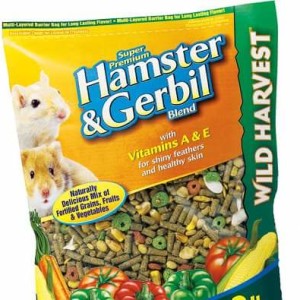
Processes can often times be time consuming and overwhelming but when you have to pull stock off the shelve because someone wasn’t
It's not a website, it's a goal!

Processes can often times be time consuming and overwhelming but when you have to pull stock off the shelve because someone wasn’t

It’s sad when you can’t get good proofing help to go with your design and this binder shows up on Wal-Mart’s shelves.
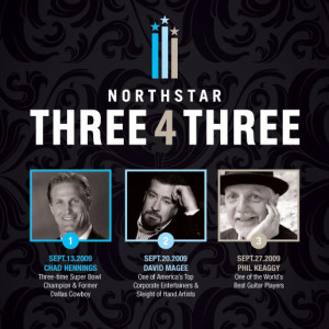
I’d like to post some designs worth complimenting from time-to-time. This design, except for the circle really close to Chad’s chin has

A layout has many sections and elements. When possible, find ways to unify sections together by using an overlapping element or in
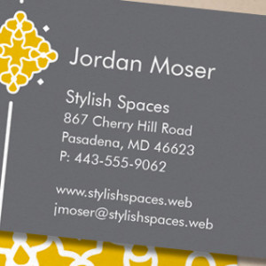
As we have progressed through time with giving out web site addresses we have dropped more and more in the long line
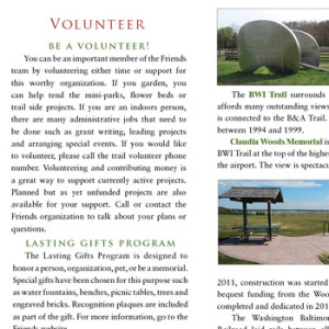
Indenting is one way of indicating a new paragraph. It isn’t the most preferred in modern layout design but it is acceptable.
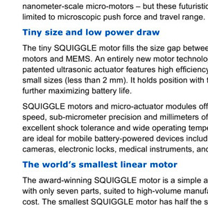
In this example, you’ll see that the designer doesn’t put a proper association with the paragraphs and their subheads. Add space before
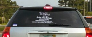
It’s sad that someone would hire a sign company to put a message on a window and they can’t even get it
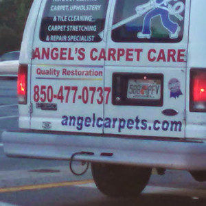
It may slow the process down but proofing will save hundreds of laughs at your expense. Might even keep you from losing
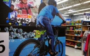
Do you think the designer of this display really thought this concept through? Smells gassy.