Skip to content
Search for:
X
Search for:
X
  • Ebert Creative

Ebert Creative

It's not a website, it's a goal!

Author: aebert

Creative Photo Box

Creative Box Photo-Ebert Creative

You know you are having fun as a designer when you realize just putting a photo in a box is average. Having

Read More

February 1, 2015June 25, 2021 aebert
Design Tips Format, Phone Number, Photo

Design it like you write it

Apostrophe Example Ebert Creative

When using script typefaces, treat apostrophes like you would when writing by hand. Connect the whole word then have the apostrophe in

Read More

January 31, 2015June 25, 2021 aebert
Design Tips Apostrophe, Typeface

Formatting a Zip Code

Zip Code example-ebert creative

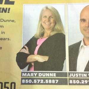
Here is a good way to include a zip code but not make it too prominent. This was a classy layout and

Read More

January 31, 2015June 25, 2021 aebert
Design Tips Effects, emphasis

Visual Clutter

Ovious Clutter-Ebert Creative

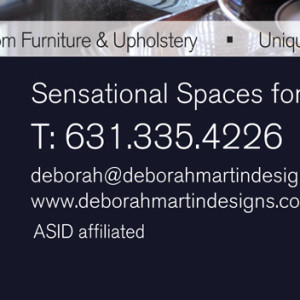
When it comes to contact information, don’t point out the obvious. In this example, the designer used “t:” to indicate the obvious

Read More

January 29, 2015June 25, 2021 aebert
Design Tips Clutter, Numbers

What’s Most Important

Hierarchy-EbertCreative

A sign of a good designer is one that understands and effectively uses good hierarchy in design. This example shows purposeful use

Read More

January 28, 2015June 25, 2021 aebert
Design Tips Constrast, Design, Hierarchy

Get your Dashes Right

Dashes EN Ebert Creative

Since designers should be responsible for everything on a page, they should also know about using the right kind dashes. Of course,

Read More

January 26, 2015June 25, 2021 aebert
Design Tips Dashes, Hyphenation

Update your Phone Number formats

Formatting Phone Numbers

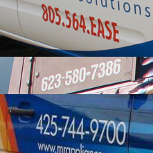
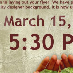
Since we are well past the days of typewriters formatting phone numbers is a must. There options are endless. Focus on dividing

Read More

January 24, 2015June 25, 2021 aebert
Design Tips Baseline Shift, Formatting, Phone Numbers

Space Between Bullets

ebert creative—space between bullets

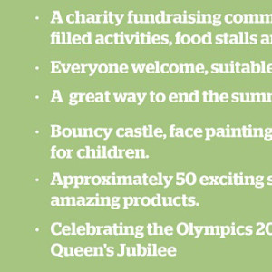
Here is a perfect example of how to space out a bulleted list. Notice how the leading is set so the bulleted

Read More

January 23, 2015June 25, 2021 aebert
Design Tips Bulleted List, Leading, Space-between

Colons Up

ebert creative baseline shift colon

Colons were meant to be used with the x-height of a typeface. When a designer uses a colon with numbers it needs

Read More

January 23, 2015June 25, 2021 aebert
Design Tips Baseline Shift, Colon, Dashes, Kerning, x-height

It just takes One

ebert creative number kerning

Numbers we meant to align vertically. Like when you are doing math. The spacing assigned to numbers is equal to each number.

Read More

January 23, 2015June 25, 2021 aebert
Design Tips Kerning, Numbers

Posts navigation

Older posts
Newer posts

Recent Posts

  • Lost Art of Illustrations
  • Slogans should be quote free.
  • Streamline the content
  • Creative Banner Design
  • Formatting Contact Info on Business cards and other promotional items

Tags

Ad Add aesthetic Background banner Baseline Shift branding Bullets Call-to-action Clutter Colons Color colors Contrast Creative Dash Dashes Design Tips Direction element emphasis Eye Flow Format Formatting Grouping Headline Hierarchy Illustration Inspiration Kerning Leading Numbers Outline Photo process proofing proportions quotes Random Readable Scale Space-between Typeface Underline Value

Categories

  • Design Tips (25)
  • Good Design (4)
  • Random (4)
  • Uncategorized (1)
Powered by WordPress

All rights reserved © Ebert Creative Fast Press Theme by Seos Themes